Library — 2 min summary
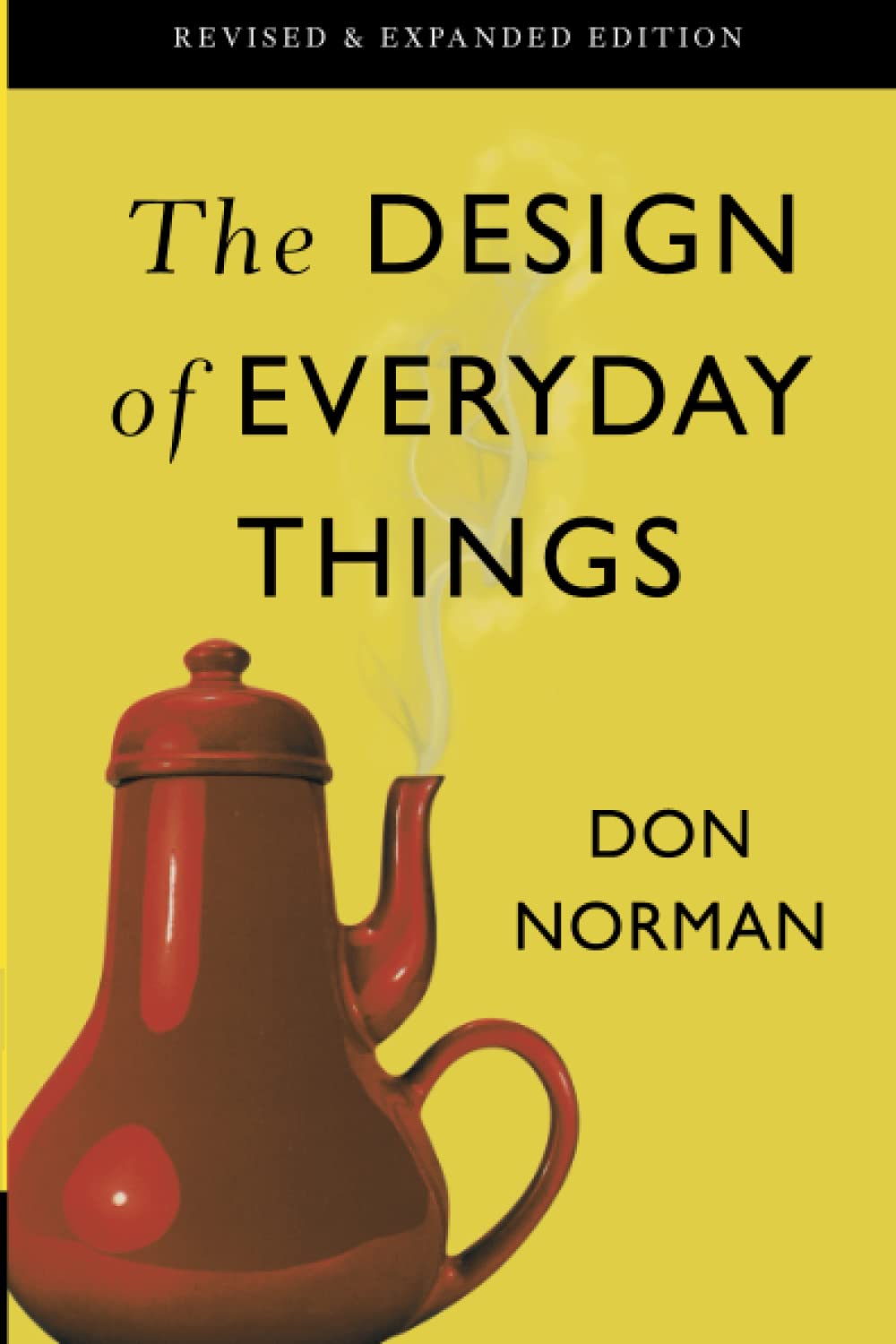
The Design of Everyday Things
by Donald A. Norman
Summary
A tougher read (I found it pretty repetetive and dry to some extends), but generally has really valuable lessons and examples.
The central idea: when people struggle with everyday objects (e.g. pushing a "pull" door, fumbling a stove) the fault usually lies with the design, not the user.
Good design is a form of communication: it should match how people perceive, learn, and make decisions. The book covers mental models, feedback and visibility, the "gulfs" between intention and action (and between system output and understanding), and how to design for human psychology rather than against it.
Two themes that especially stood out to me, that I think are very applicable to application UX on the web, so I'm trying to deploy them more:
- Affordances: Design so that how something works can be inferred from how it looks and feels. The object should suggest its use: a teapot’s handle invites gripping, its spout suggests pouring. When affordances are clear, people can use things correctly without instructions.
- Encourage right behavior vs. discourage wrong behavior: Design can aim to make the right action obvious and easy, or to make the wrong action difficult or impossible. Which approach to favor depends on context: sometimes you want to nudge people toward the desired path; sometimes you need to block mistakes (e.g. safety-critical systems). Choose based on the consequences of error and how much you can rely on attention and learning.
